Steal These Caption Style Presets: The 2025 Guide for TikTok, Reels & Shorts
Let's be real. Your video might be amazing, but if your captions are an afterthought, you're losing viewers. People scroll fast.
Generic, unreadable, or off-brand subtitles don't just look bad; they kill your engagement and make your content inaccessible.
But what if you had a playbook? What if you could use caption style presets to create stunning, brand-consistent captions in seconds? This guide is your new playbook. We're cutting the fluff and giving you actionable styles you can use today to stop the scroll and get your message heard.
Why Your 'Caption Look' Is a Secret Weapon
Before we get to the styles, let's talk strategy. Your captions aren't just text; they're a core part of your video's design.
Brand Identity: Using consistent font & color subtitle templates makes your content instantly recognizable. A fitness coach who always uses their brand's bold, yellow font for key moves builds brand recall with every post.
Scannability: Most social video is watched without sound. A cooking creator using "karaoke" style highlights for ingredients helps viewers follow along, boosting watch time.
Accessibility: This isn't optional. Clear, high-contrast captions mean viewers with hearing impairments or those in loud environments can fully experience your content. It's a legal and ethical must, as outlined in the Web Content Accessibility Guidelines (WCAG) 2.2.
This is what our Nemovideo AI video editor is built for. It helps you generate accurate captions and then style them, allowing you to create and save pre-made subtitle designs to use across all your content.
The Foundation: Readability First
If viewers can't read your captions, nothing else matters. These two styles are your workhorses.
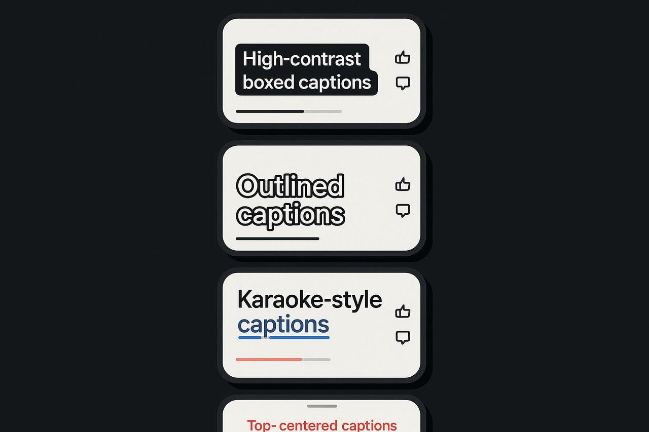
The Classic Box
This is the gold standard for a reason.
What it is: White text on a semi-transparent black background.
Best for: Busy footage, fast-paced speech, and guaranteeing legibility. Think of MrBeast's videos; his captions are almost always bold, boxed, and impossible to miss.
Pro-Tip: Keep the box opacity around 60-80%. You want the text to pop, but you don't want to completely block the video behind it. This style is a great way to meet WCAG contrast minimums easily.
The Clean Outline (Stroke)
A lighter, more modern look that still packs a punch.
What it is: Bold text (often white) with a thin, dark outline.
Best for: Minimalist aesthetics or talking-head videos where a full box feels too heavy.
Pro-Tip: Make the outline just thick enough to separate the text from busy backgrounds. This style is flexible, but you must test it on both light and dark scenes from your video.
The Energy: Styles that Stop the Scroll
Got the basics? Good. Now let's grab their attention.
The "Karaoke" Highlight
You've seen this everywhere. It's hypnotic.
What it is: Words highlight in a different color (usually a bright brand color) as they're spoken.
Best for: Music, punchy monologues, and emphasizing a key script.
Pro-Tip: Use this to guide the viewer's ear and eye. It dramatically increases engagement, especially for the hook. You can see a great CapCut karaoke highlight tutorial to learn the technique.
The Keyword "Pop"
A simple animation that adds huge emphasis.
What it is: Most of the caption is static, but key words or phrases briefly scale up or change color.
Best for: Emphasizing benefits ("10K in 30 Days"), a feeling ("instantly"), or a call-to-action ("Click Now").
Pro-Tip: Don't overdo it. One or two "pops" per sentence is all you need. This is about emphasis, not chaos.
The Brand: Building Your Signature Look
This is where you turn your captions into a style guide for captions.
The Brand Bar
This looks professional and keeps your text clean.
What it is: A semi-transparent bar in your brand color that runs along the bottom, with your captions placed on top.
Best for: Paid ads, product demos, and any content where brand recall is critical.
Pro-Tip: Use this to create your own "safe zone." It guarantees your text contrast is perfect, no matter what's happening in the video.
The Editorial
This is pure class.
What it is: Using a high-end serif font for a short, powerful hook, then switching to a clean sans-serif for the rest of the video.
Best for: Educational, luxury, or storytelling content. A history creator might use this to build atmosphere.
Pro-Tip: The goal is to build your customizable subtitle looks over time. The easiest way? Create your font & color subtitle templates once inside Nemovideo and apply them forever.
Your Quick-Start Workflow: From Draft to Done
Having great styles is one thing. Using them efficiently is another.
Stop Blocking the UI. Your captions are useless if they're hidden by the "Follow" button. Always respect the "safe zones." We recommend checking this safe zone guide for Reels and TikTok as a starting point, but always test on a real device.
Be Accessible (It's Not Optional). This is crucial. Use clean sans-serif fonts. Check your contrast. This advice on accessible colors is a great start. Think like the pros at Netflix and even follow US federal guidance on captioning. Platforms like TikTok and Instagram provide their own accessibility tools; use them.
Build Your Presets. This is the real time-saver. Stop remaking your captions every. single. time. Create your caption style presets once. This is the core of a smart workflow.
Stop Guessing. Start Designing.
Stop fighting with clunky text editors and boring default fonts. Your content deserves better. It's time to make your captions as compelling as your video.
The Nemovideo AI editor makes this easy. You can generate captions, then instantly apply your saved customizable subtitle looks with one click. Tweak the colors, save a new preset, and get back to creating.
Sign up for Nemovideo today and turn your captions from an afterthought into an advantage.
Quick FAQ
Q: What is a “safe area” for captions?
A: The "safe" part of your screen that isn't covered by platform buttons, usernames, or watermarks. We love this safe zone guide as a visual starting point, but always double-check in the app itself.
Q: How many lines should captions be?
A: One or two. Max. Keep it scannable and follow best practices.
Q: What fonts work best?
A: Clean sans-serifs (like Roboto, Poppins, or Inter) are your workhorse. They are built for screen readability. Save the fancy serif fonts for 1-2 word hooks.
Q: Are animated caption styles bad for accessibility?
A: Not if used for emphasis! A "karaoke" style is great. Just don't make the entire text bounce, flash, or animate, or your audience will (rightfully) scroll away.